
Some of the real power of SharePoint as a content management system is its use of lists and web parts working in tandem to manage the display of information on web pages. The articles linked to here discuss some of the particular web parts and relationships to lists as we use them in the Oregon.gov web site.
Note: For the most part, Oregon.gov authors need to stick to the web parts that are offered in the 'Oregon' category when looking at the web part insertion tool. These web parts have the Oregon.gov look and feel applied to them and have a higher level of accessibility to them than out of the box SharePoint web parts. The out of the box web parts may work for your purposes, but keep the styling and accessibility in mind and consider the trade off if they are chosen for use on a page.
The exception is the 'Content Editor' web part which has its place in embedding content from other sources on the page. An example would be including an instructional video from YouTube on an Oregon.gov web page. Since the content editor embeds content from other sources, the accessibility of it's contents will match that of the source content.
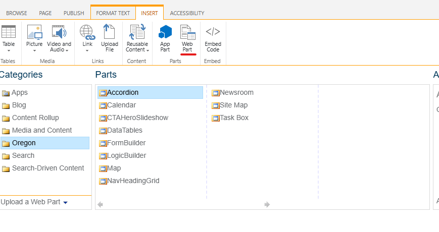
Web parts are accessed via the ribbon. Put your cursor into a content well, then click the "Insert" Ribbon > "Web Part" then choose the category and the part.
What's a Web Part?
Web parts are essentially a set of instructions to SharePoint about how to display a body of data or content on a page. The data or content exists independent of the page and is called on to the page by the web part instructions. Some of the instructions in each web part are adjustable in the web part settings window. That's where authors get to tell the web part what list to look at, which view to use, and in some cases, which columns to use for certain display items. There are also feature options available in many web parts.
Notice in the image to the right how some items in web parts are optional and how the behavioral settings may be toggled either on or off and the web part will still function as designed.
Sometimes, looking at the web part settings screen helps to construct a list that will naturally populate the web part. Lists that are built without a web part or how they will be consumed by a web page in mind can wind up having a somewhat clunky or disjointed appearance when displayed on the page.

Suggested Viewing
If you are not familiar with building lists and views, you may want to watch these. Web parts look to well formed lists for their content.
Web Part Articles
These articles and videos concentrate on individual web parts in the Oregon category.
Accordion
The Accordion web part provides a vertical stack of accessible, expandable/collapsible information panes, each designated by a heading containing a title, subtitle, and/or thumbnail image.
Calendar
The Calendar web part provides a responsive, accessible calendar with two views (Month and List/Agenda) to display calendar events from a SharePoint calendar list.
Data Table
The Data Table webpart displays data in a structured, table-based format. It can pull datasets from SharePoint lists and tables on data.oregon.gov.
Form Builder
The Form Builder is offered as a free option to collect non Personally Identifiable Information (PII) from web site visitors for any number of agency, board or commission purposes.
Map
The Map web part provides a simple, Google Maps-based interface to display a single SharePoint list's content (which has latitude and longitude fields) with an interactive map.
Newsroom
The Newsroom Web Part is used to display entries from the Statewide Newsroom Application on Oregon.gov web pages
Site Map
The Site Map web part provides an alphabetized, tiered, unordered list of subsites and pages, which reflects the website’s hierarchical structure.
Task Box
The Task Box web part provides a card-based information container, with a heading and grouped, unordered list of links, as well as optional image cap and/or description.
CTA Hero Slideshow
The CTA Hero Slideshow Webpart displays page-wide images with cards that include a category, heading, description paragraph, and a call-to-action button.
Nav Heading Grid Webpart
The Nav Heading Grid webpart can be used to create a series of navigation links with corresponding icons in a grid format.
Icon Story Card Rotator
The icon story card rotator webpart creates a carousel of cards that the user can scroll through.
CTA Nav Image Reveal Grid
The CTA Nav Image Reveal Grid webpart allows for a three-panel-wide grid of links with a hidden description that reveals itself on hover.
CTA Card Flipping Grid
The card flipping grid webpart creates a series of animated cards that flip, revealing the content on the reverse side.
Still have questions?
You can:
- Search the Knowledge Base for what you are looking for:
- You can find more articles in the V4.x Article Index
- You can submit a question to the Oregon E-Government Service Desk
Comments
0 comments
Article is closed for comments.